
Overview
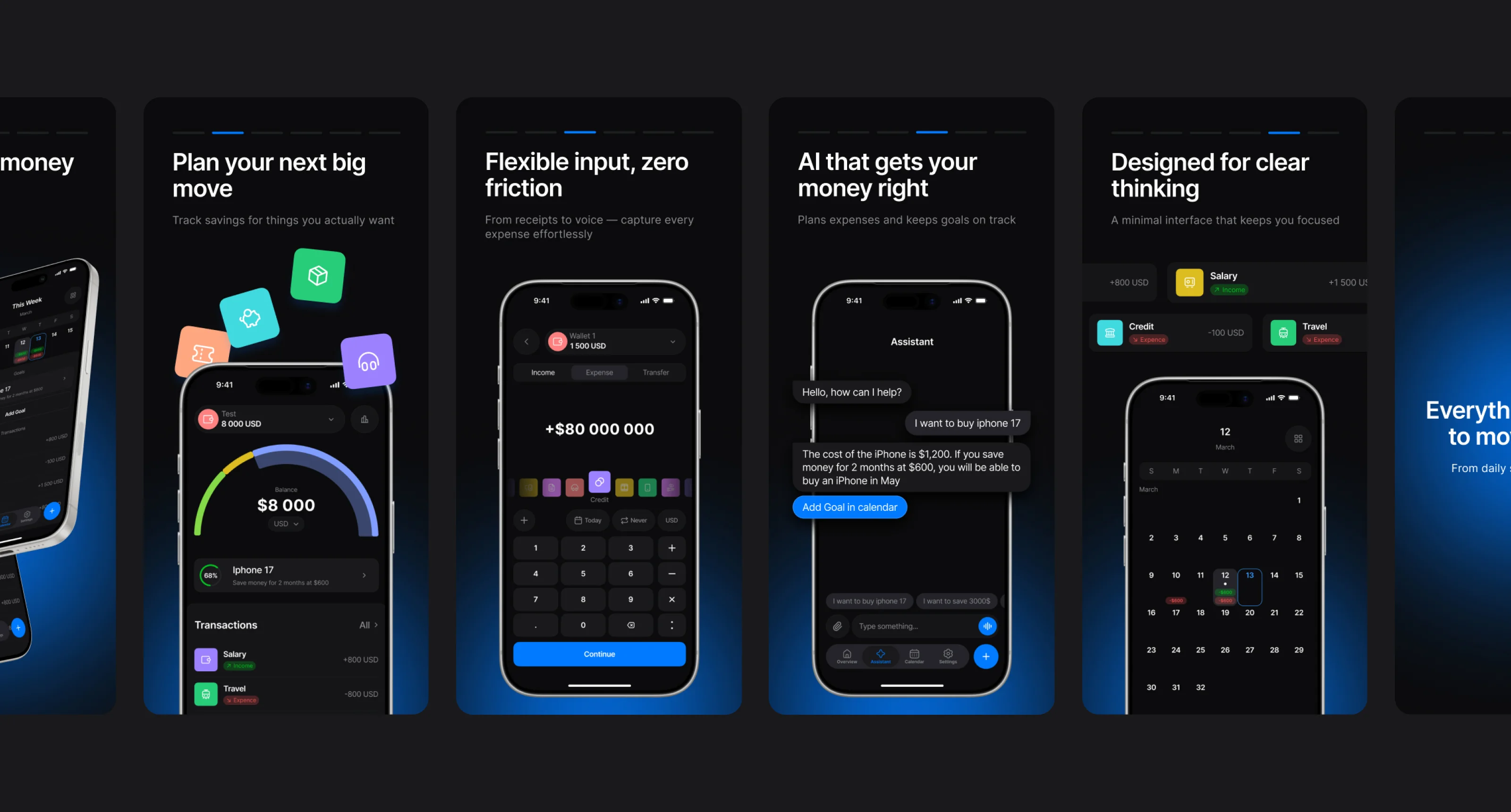
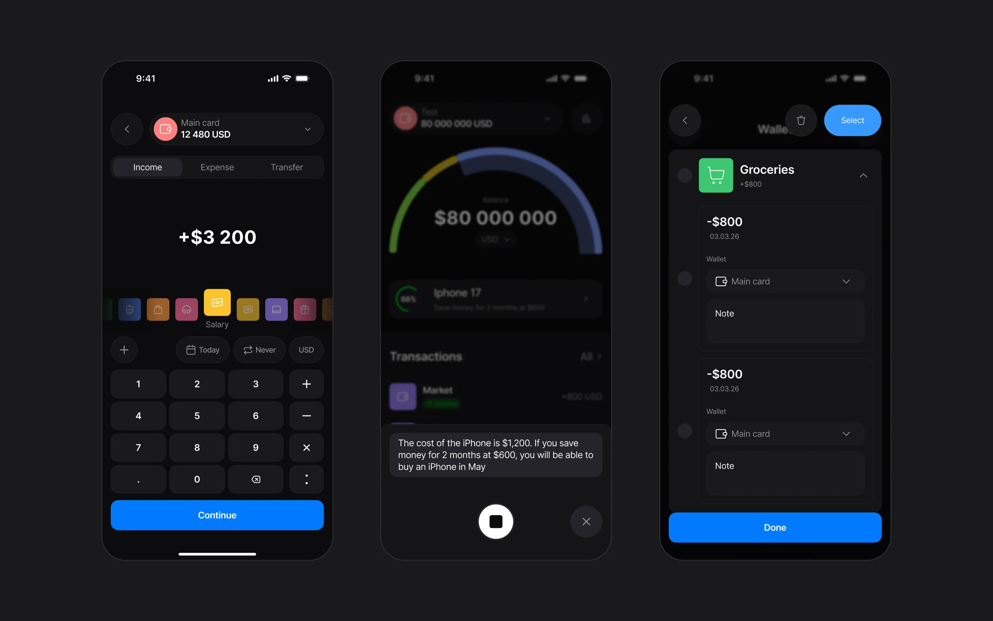
A personal finance app where logging an expense takes seconds — by text, voice or a photo of the receipt — and an AI assistant turns spending into plans.
The task
People give up on expense trackers because logging every purchase is slow and boring. The stats end up wrong, and nobody knows where the money went. The client wanted an app that fixes the habit, not just the spreadsheet.
Research
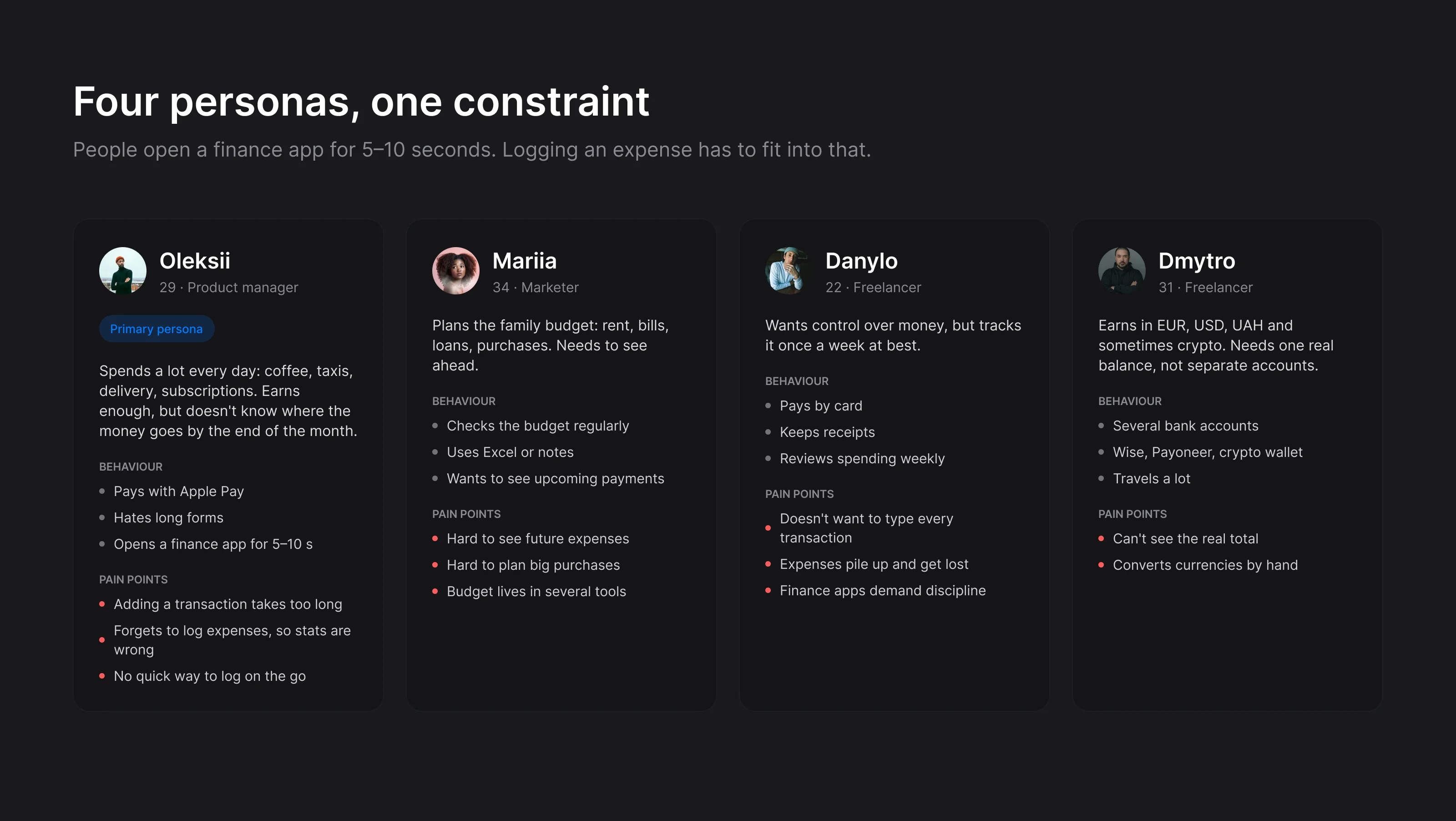
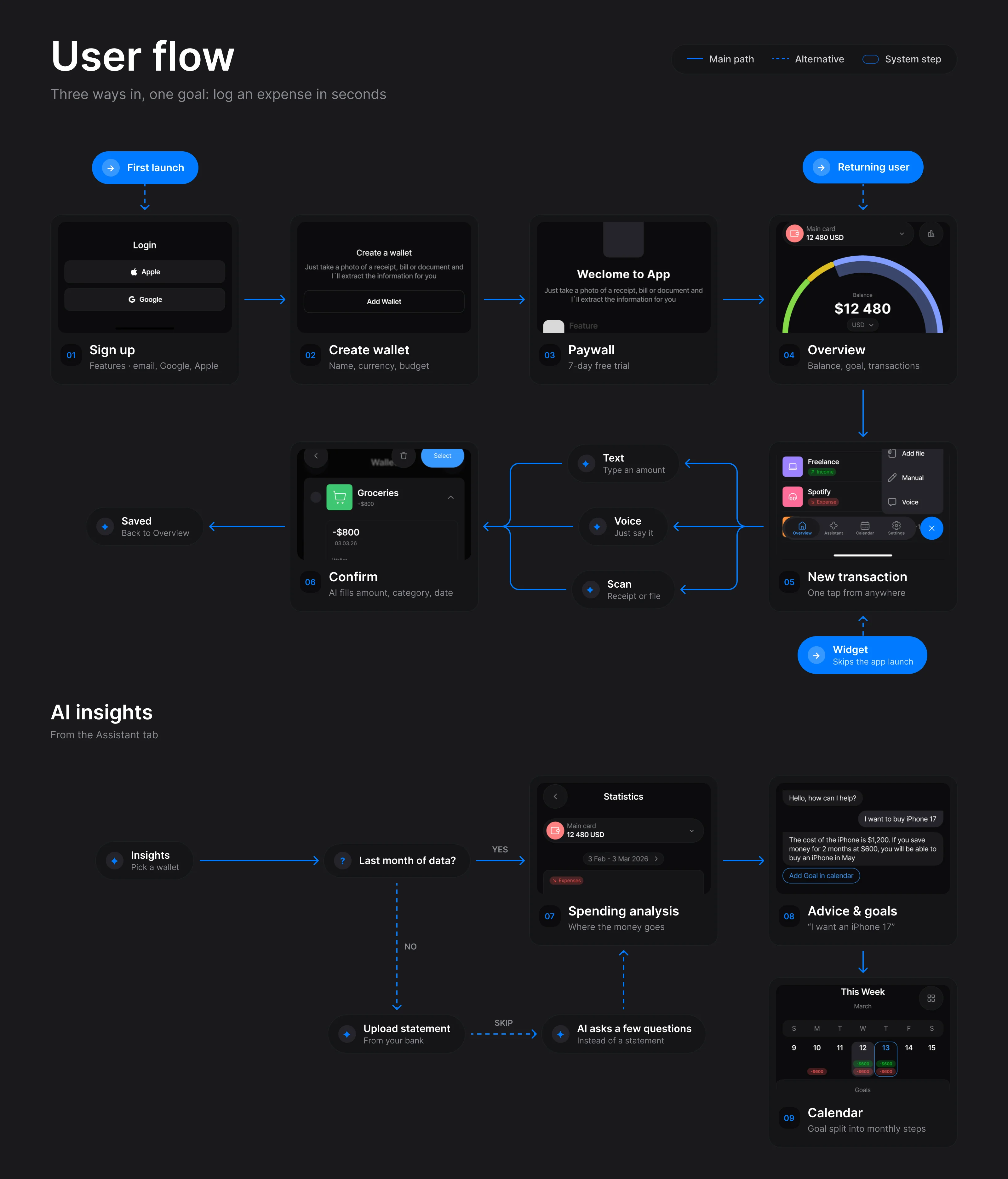
I started with four personas, from a product manager who pays with Apple Pay to a freelancer earning in three currencies. They all had the same constraint: a finance app gets 5–10 seconds of attention. So the main flows were built around that: three ways in — first launch, returning user and a home screen widget — and one goal, logging an expense in seconds.
Structure
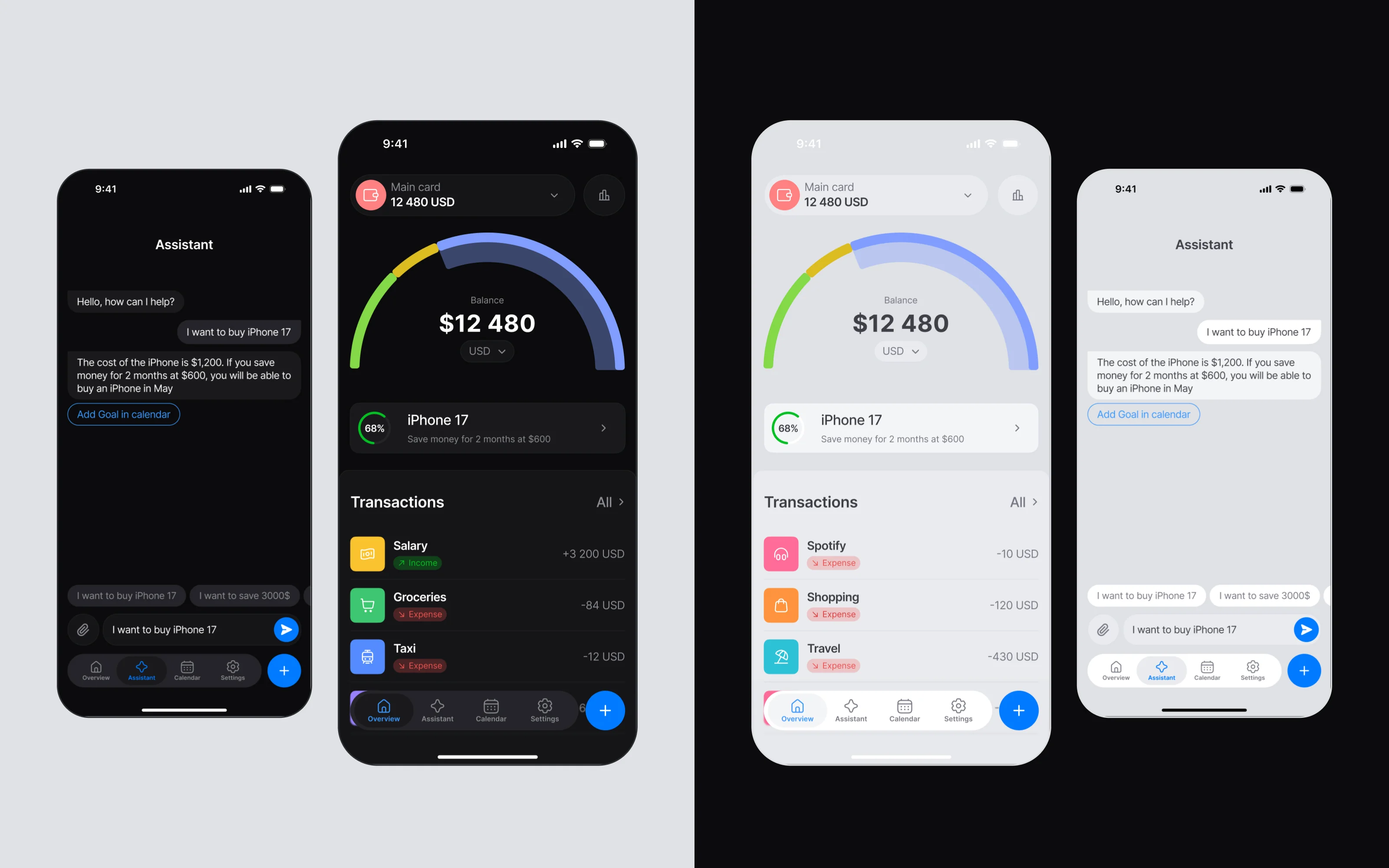
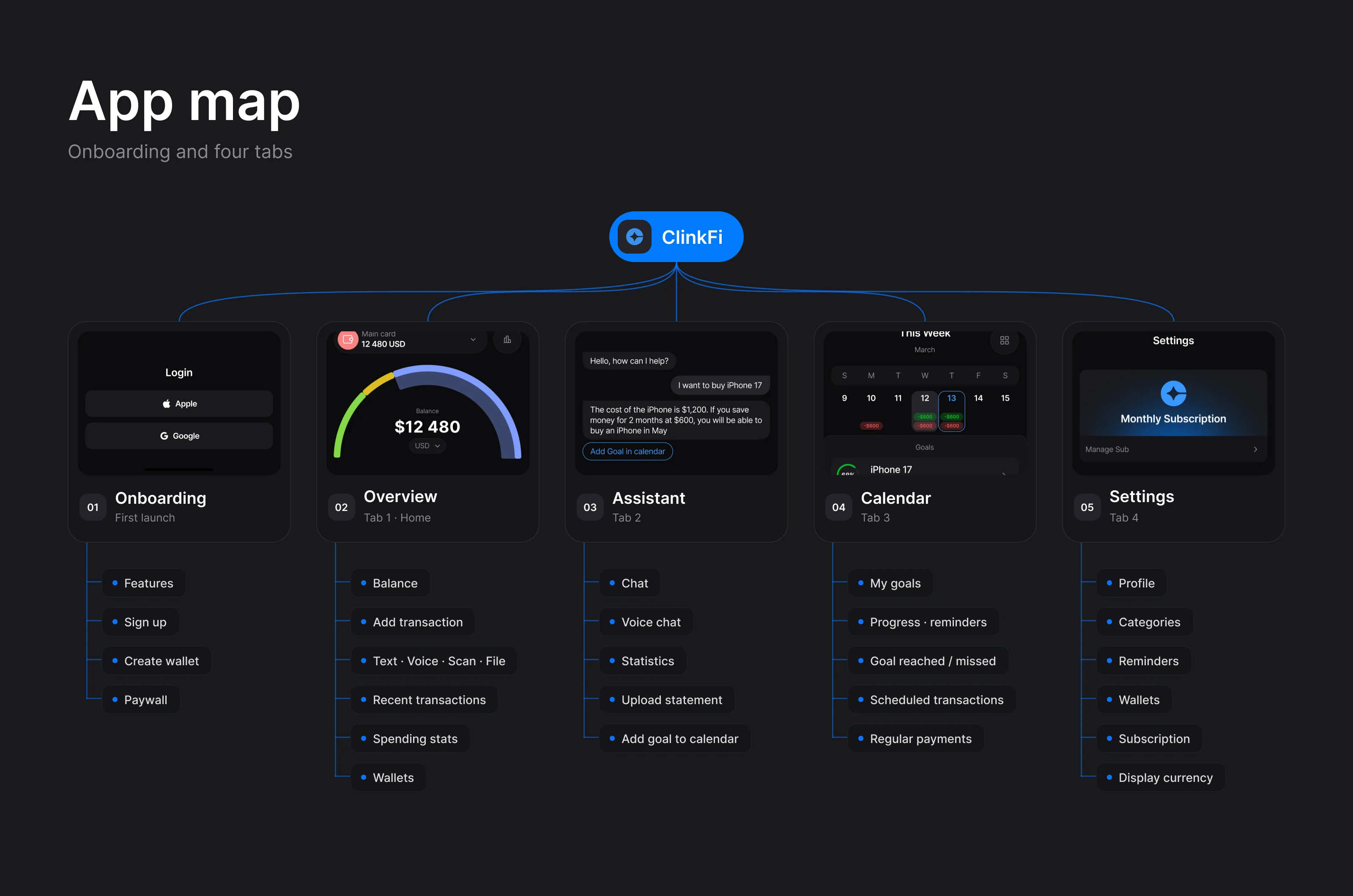
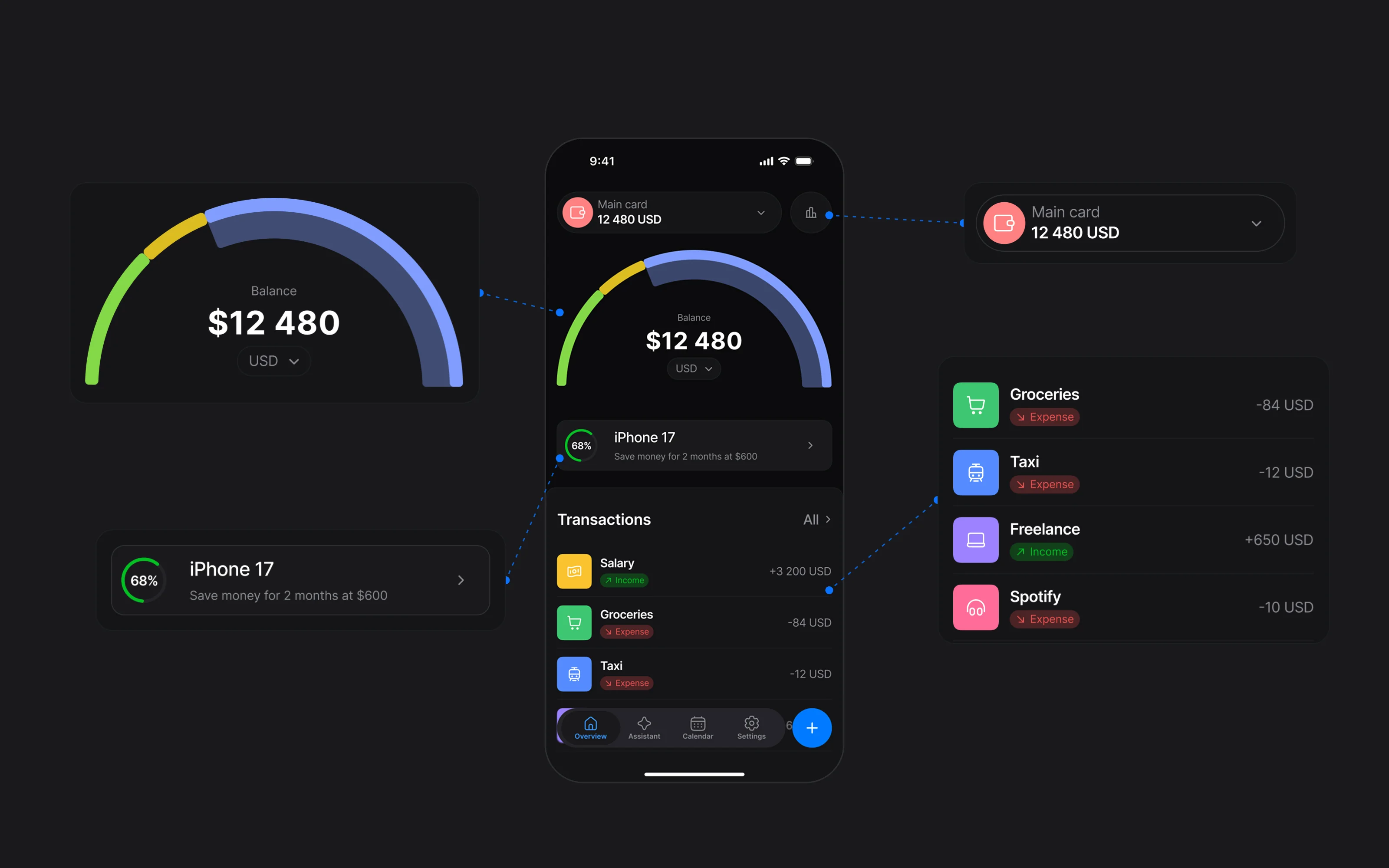
The app is onboarding and four tabs: Overview, Assistant, Calendar and Settings. Everything that matters sits on the first screen — balance across wallets, the current goal with an AI hint and the latest spending. Adding a transaction is one tap from anywhere: type it, say it or snap the receipt, and AI fills in the amount, category and date.
System
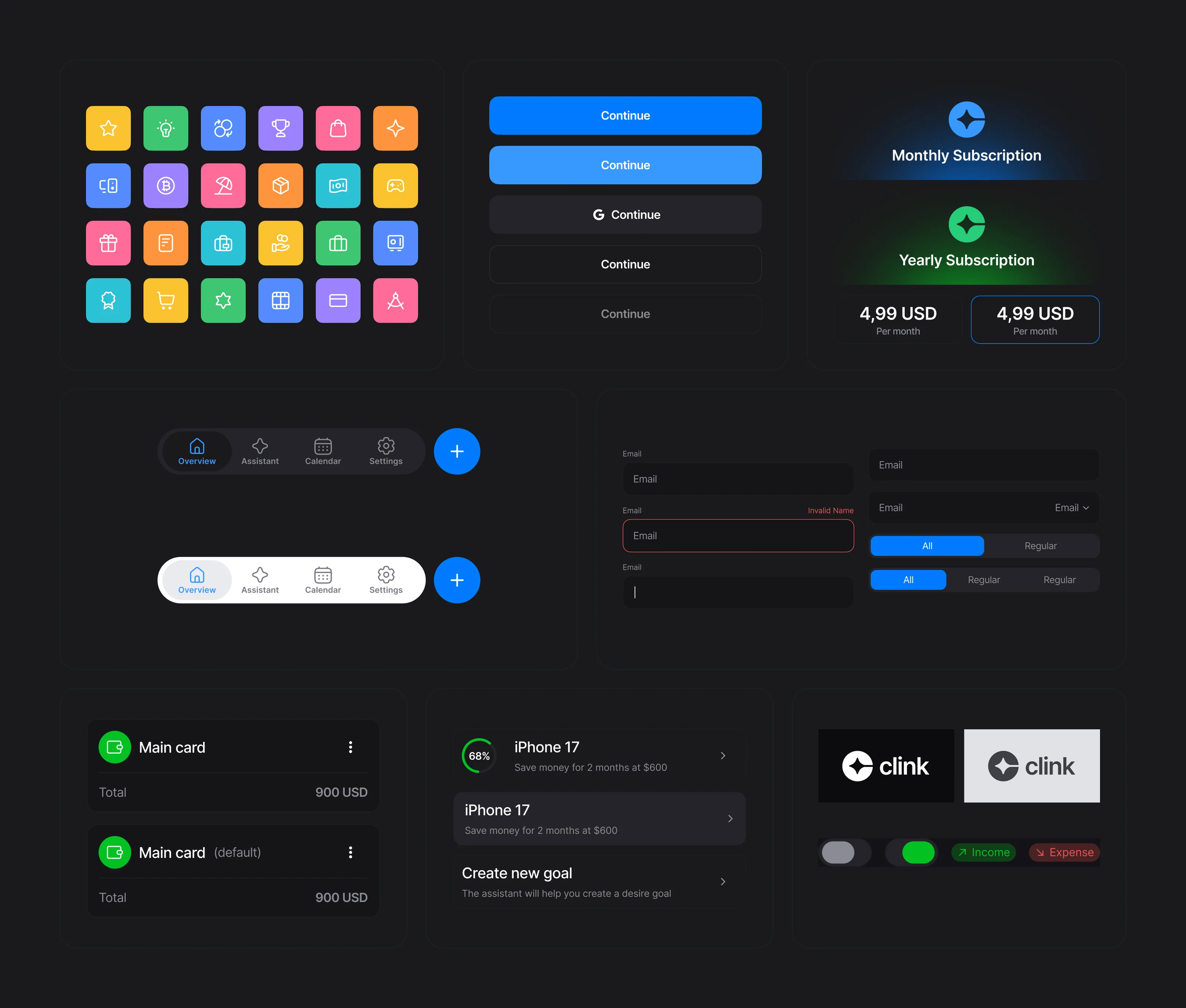
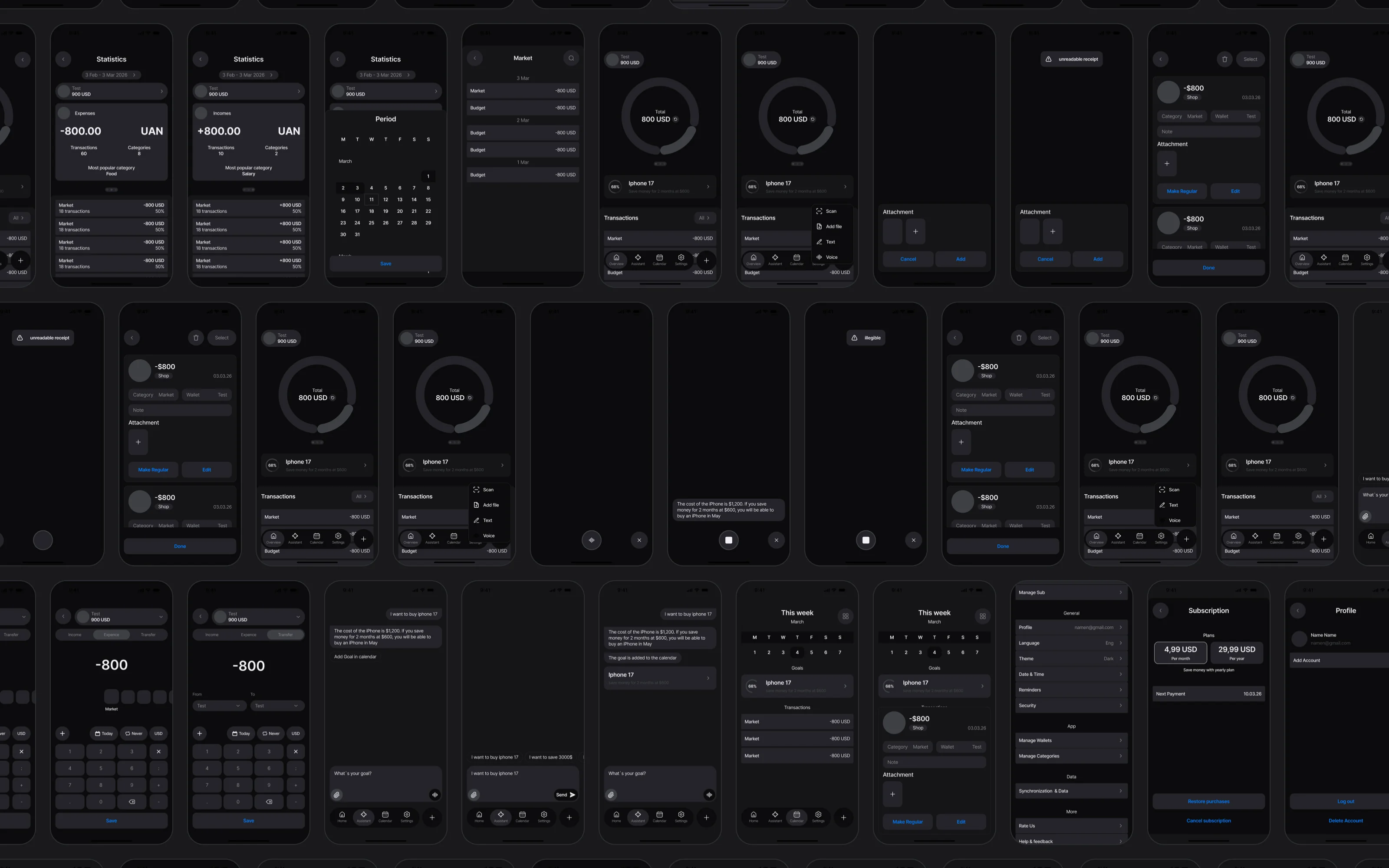
Behind it is one component library: cards, inputs, buttons, tags, tab bars and a set of category icons. It made a full light theme possible without redrawing screens. The product went from more than 70 wireframes to the final UI and launched on the App Store.